THE CLIENT:
Abt Associates, a global leader in research, evaluation and program implementation.
THE CHALLENGE:
Members of the Abt Associates team working with the Bureau of Justice Statistics were tasked with gathering and analyzing years of historical incarceration data, modernizing and improving the user experience of their website, and presenting results of their findings at a national conference.
I worked independently on the design elements and in conjunction with two managers and a data analyst on the data collection and assembling the presentation. The goal was to:
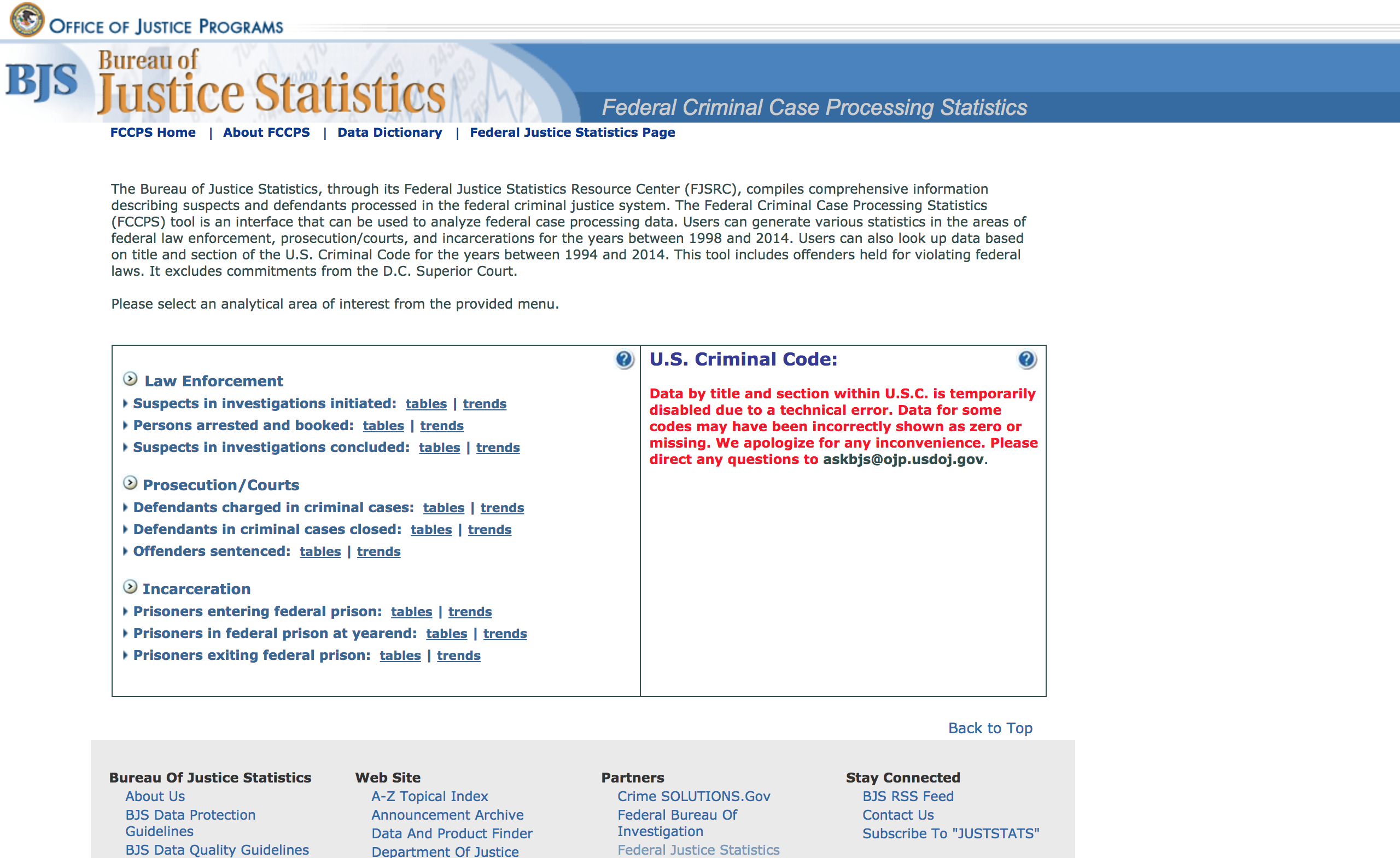
- Reorganize the BJS Federal Justice Statistics Resource Center website to improve its flow, brand consistency, and usefulness;
- Use the data visualization tools available to create more user-friendly tools on the website;
- Allow users to drill into the accessible data in various dimensions; and
- Show examples of the visualizations at the conference to tell example stories that the presenters would wish to convey.
THE SCOPE:
Independent design work collaborating with four other team members. 8-week on-site participation.
UX/UI SKILLS USED:
Data Visualization, Information Architecture, Branding, Research.
TOOLS USED:
Tableau, Balsamiq, Microsoft Excel, Microsoft Powerpoint, pen and paper.
THE PROCESS:
Upon entry into the proejct, the initial involvement was completing the research and pulling the corect data that would need to be categorized and processed in the visaualizations. While the goal was to make all data available on the site in a convenient manner to the user, the cache of data we were working with was large enough that it required me to work with the lead data engineer to diagnose which was most critical to utilize for the presentation. It was determined that it needed to be:
- Relevant to what a user may search for;
- Simple enough in complexity to remain accessible; and
- Small enough in size that a Tableau workbook could be produced without lag.
The next task was reworking the information architecture of the current site to produce a cleaner flow and approach for users. To do so, I analyzed the site's current layout and performed use-case scenarios of potential site visits based off feedback from previous users of the site. Once I identified the bottlenecks and unnecessary hurdles that were in the current site's layout, I sketched out a potential re-mapping of the architecture to optimize usage. Working with the managers, and considering time constraints and scope of the project, we found the most important updates that would be needed to make.
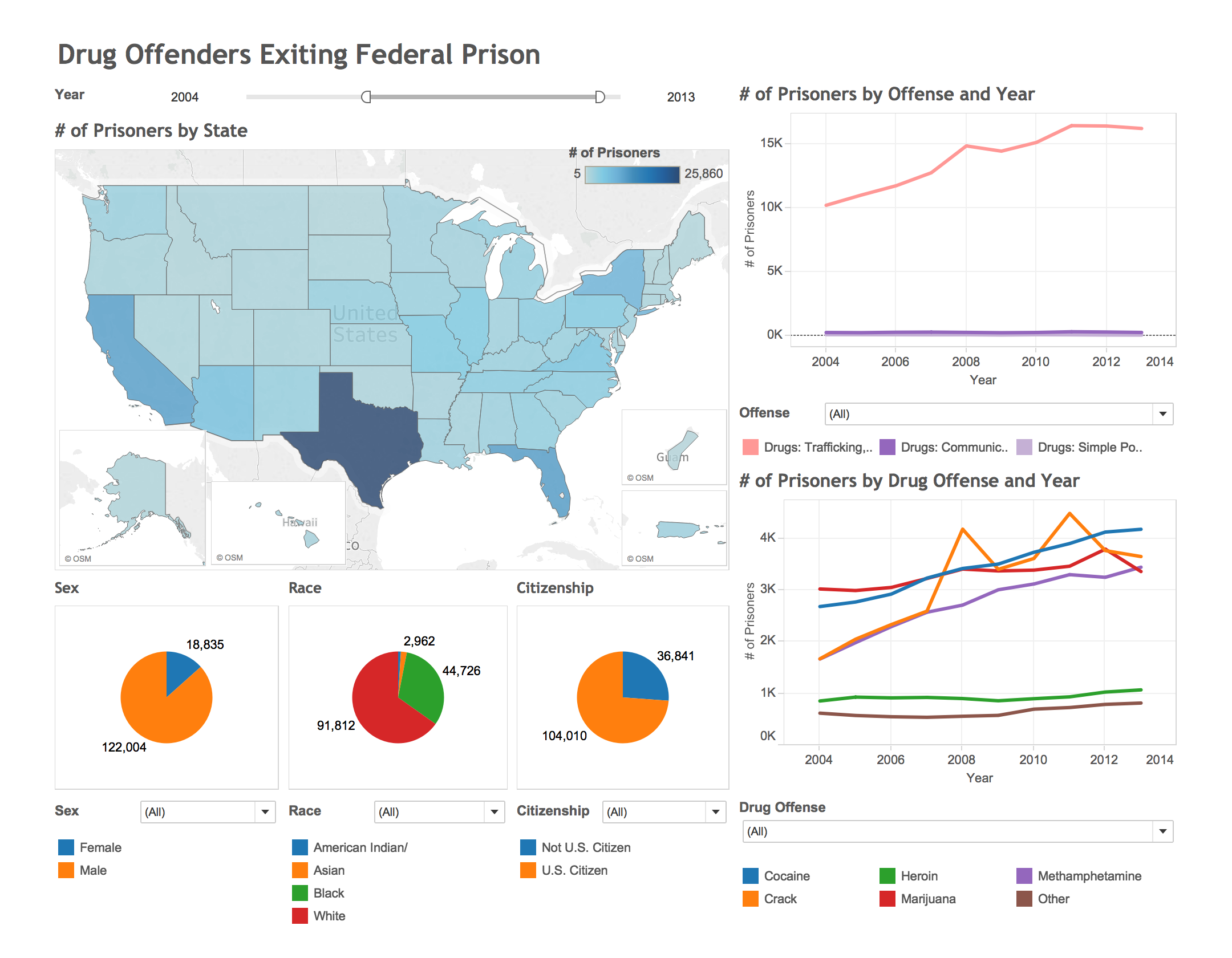
The final aspect of my work entailed creating useful and optically interesting data visualizations that would be used for the conference presentation and that could be adapted to use on the BJS FJSRC website. I worked with the managers and presenters to create stories that would utilize three different potential scenarios to use as examples. One would be zeroing in on prisoners released from drug offenses, with the ability to filter and drill down by location and prisoner attributes. The second would be to filter offenders sentenced by offense, with multiple view options (e.g. average sentence length). The third would show prisoners in federal prisons at year end, with the ability to drill down by various offenses and sub-offenses.
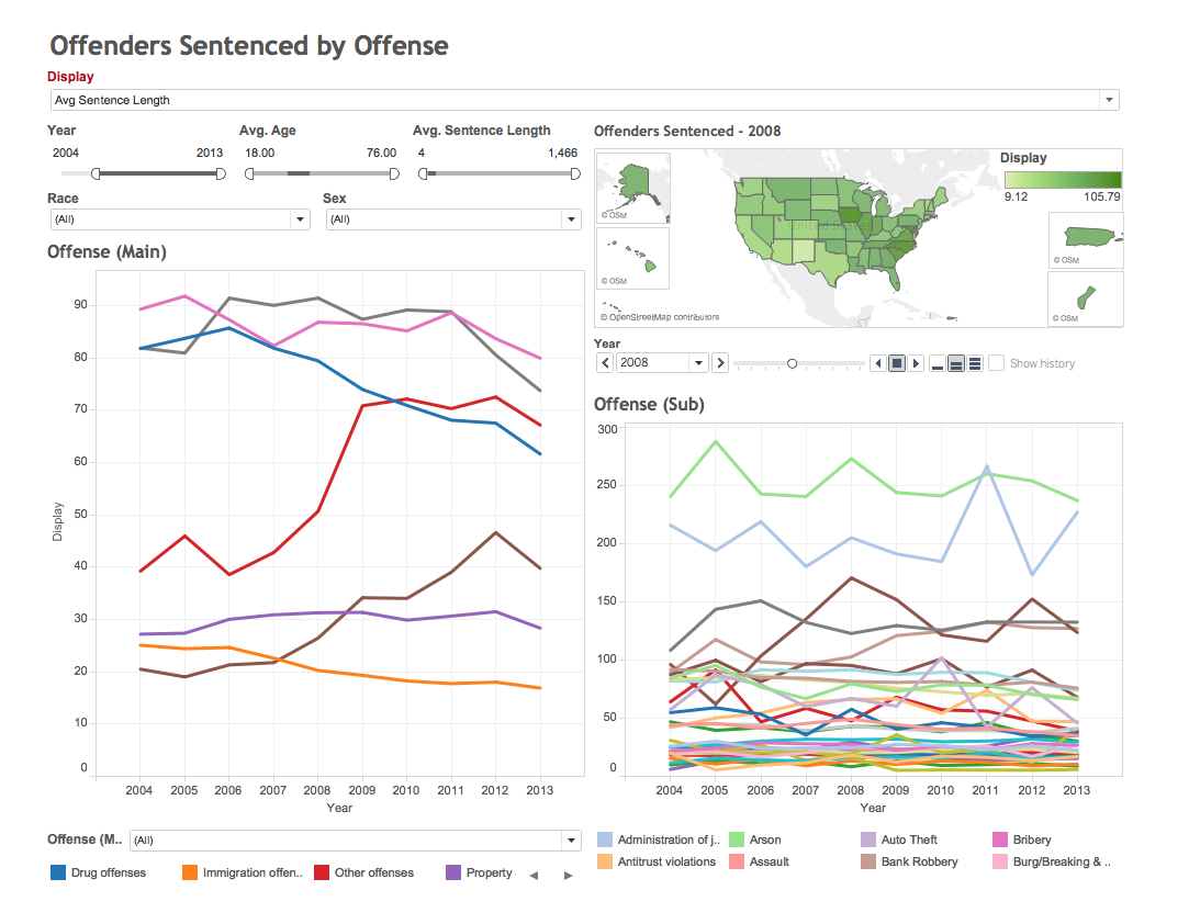
I took the three stories that needed to be told and sketched out possible storyboards that would provide easy navigation and usability. Our team determined that it would be ideal to confine the visualizations to a single page so as to reduce the amount of "page jumping" that would be required. Creating a single-page approach would allow users to filter and drill as they wished and to explore multiple scenarios easily.
I sketched out possible designs of how to incorporate enough information into a single screen without overcrowding the user with options. Each version of a potential visualization I iterated I would check in with the presenters for feedback. Once a suitable option was designed, I began creating a working product with Tableau. Due to restricitons within the software, this required additional check-ins with both the data engineers and the presenters, as we found suitable alternatives to any problems which arose.
THE SOLUTION:
After determining the extent of the limitations I was able to create Tableau presentations that could be successfully used to tell the stories the presenters wished to convey. They were able to present a single screen to the audience and drill into various categories, using filters to manipulate the data at their will. The length of my contract did not require me to stay on to see the updates to the BJS website take effect, though I submitted a information architecture suggestions and flow charts, updated filtering mechanism designs, and the necessary Tableau presentation bundles that could be integrated into the site.