THE CHALLENGE:
In order to present my work in a clear, personalized manner to viewers, it was necessary to build a site to host my portfolio pieces. There were three possible ways to accomplishing this:
- Host my work on a pre-built portfolio site, such as Behance or Dribbble.
- Create my own site, but use a pre-made template such as Wordpress or Squarespace.
- Build a website to host my portfolio from scratch.
I wanted to use this as a channel to not only display pieces I’ve produced, but also to demonstrate my abilities, so I opted to create my portfolio from scratch.
THE SCOPE:
Solo effort, comprising all aspects of front-end design and development.
UX/UI SKILLS USED:
Website Design, Visual Design, Front-end Development, Information Architecture, Wireframing.
TOOLS USED:
Sublime Text 2 (HTML5, CSS3), Adobe Photoshop, Adobe Illustrator, Sketch, Balsamiq, pen and paper.
THE PROCESS:
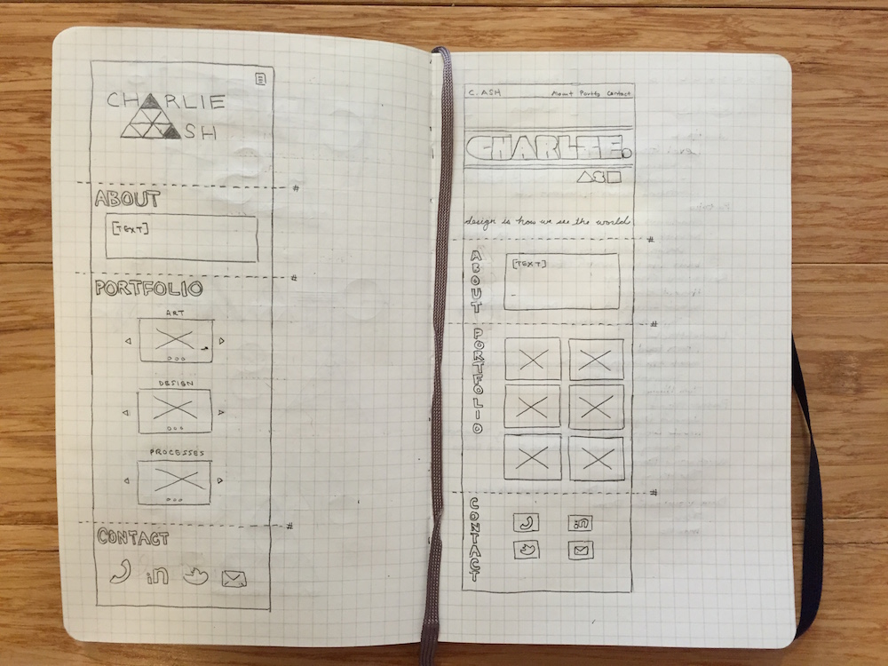
The first step to completing this process was to establish what I wanted to convey through the design. I began by sketching potential designs and information architecture layouts, using my experience reviewing leading design websites that maximize creativity yet maintain a clear, intuitive flow.
I knew I wanted a crisp, minimalistic appearance to the landing page and to have the page’s emphasis be on my personal logo, which I would be designing myself as well. This landing page should reflect the sort of design that might be expected from me. It should be the portfolio of someone who appreciates clean aesthetics, a soothing user experience, and who focuses on UX- and UI-design.
The rest of the homepage—the About Me, Portfolio, Contact, etc.—sections should reflect my style, with a professional appearance. I opted for clear sans-serif font a in front of a primarily solid background, allowing for a clean, easy viewing and reading experience. It was also important to distinguish each page that was a level or more below the homepage as maintaining a consistent brand that elicited the same tone as the homepage.
To bridge the gap between creativity and complexity--and allow myself to explore some more complex ideas--I used a Bootstrap framework which I then modified to achieve my desired goal. It allowed for some more advanced features (for example, a parallax effect) that featured my HTML5, CSS3, and Javascript skills.
THE SOLUTION:
The produced portfolio, as it is seen currently, is the first iteration in what I hope to be a successful and fulfilling career in web design. The design invokes the process my projects reflect: a clear, concise design, beginning with pen wireframing on graph paper and with minimal “flair,” but clear creativity to create a unique brand for each product. This version of the portfolio utilizes my early work in wireframing, prototyping, visual design, branding, typography, front-end development, and information architecture. As my skills grow and become more refined, I will add pieces that reflect my increased abilities and creative expansion.
UPDATE: 2017
In 2017 I undertook the task of updating my website, both to modernize its look and to add additional content to it. I had acquired more web design knowledge which would allow me to enhance features on the site and showcase additional roles I was capable of performing.
My first undertaking was adding additional work I have completed. I added an additional four projects to the Portfolio section of my site. These showcased increased use in areas around prototyping, graphic design, and data visualization. I also added the ability to click on an image and present it as a modal, which would allow the viewer to more clearly see my work.
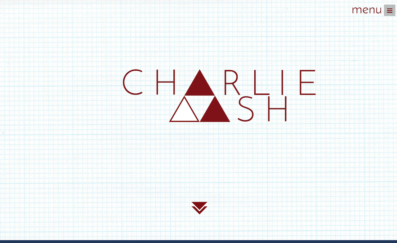
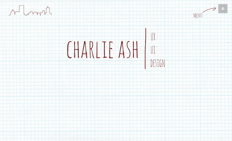
The second aspect I wanted to improve was the landing page. It originally reinforced my interest in drawing and the idea that I began every project by sketching it out on pen and paper. While I wanted to keep that aspect of it, I felt it was also important to modernize the page and give it cleaner lines and a less-cluttered appearance, reflecting my design philosophy. A created a new personal logo and updated the fonts to reflect this.
Lastly, I wanted to incorporate some animation via Javascript to the site. I wanted it to not be distraction, but to capture the viewer and increase the enjoyment and interest of their visit. Not being a front-end designer by trade, though having coded my site with only a bootstrap framework, I knew I'd have to keep it within scope for my abilities. I felt that adding more interest to the landing page by fading in my name would be a suitable way to do this. Adding the animation has increased interest and average time per page.